
Content must be presented in ways that can be perceived through sight, hearing, or touch, making it accessible to users with different sensory abilities.
Accessibility
Making sure your site is equally accessible to everyone
What is Accessibility?
Website accessibility means making your website usable and equally accessible for people with various disabilities. The Web Content Accessibility Guidelines (WCAG) 2.2 are organized around four principles (POUR):
Perceivable
Operable
All forms, controls, and navigation must be usable by people with disabilities, allowing them to interact with the website effectively.
Understandable
The interface should be easy to comprehend, with clear instructions and consistent design to prevent user confusion.
Robust
Content must be compatible with various technologies, including assistive devices like screen readers, ensuring it works across current and future tools.
Why is Accessibility Important?
Between 15-25% of the U.S. population lives with some form of disability. That’s a big market segment you don’t want to ignore. Not to mention that web accessibility is legally required under the ADA (The Americans with Disabilities Act). Thousands of accessibility lawsuits happen every year, with the number continuing to rise exponentially. Accessibility is better for your users, and better for you.
Here’s the good news. Your website’s design and code will already be engineered by Asher to pass color contrast ratios and technical best practices.
What accessibility do I need to know?
Since the design and code are being handled by Asher, that just leaves the site’s content – text, images, and other media. We’ll walk you through the basic best practices on how to create and format your content for accessibility.
These fall into three main areas:
Headings
This is for SEO and also for users to visualize your content better.
Hyperlinks
Making sure devices can read links correctly, and the text describes the destination correctly.
Media
Adding alt text to images that is concise, and not redundant.
Headings
Headings are used to organize content on a page. They function as titles and headlines and are visually distinct from “normal” paragraph text (different font, larger size, etc). But they’re not just for looks – assistive technology and search engines view headings as more important than paragraph text, so getting them right is important for both your accessibility and your SEO.
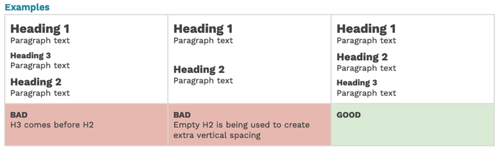
- Every page should have only one H1 that describes the entire page. Your site handles this automatically! Your H1s are the large titles at the top of each page, and we’ve restricted you from being able to add extra H1s anywhere else.
- The remaining heading levels need to be used in order: H2s for broader main ideas or sections, H3s for more specific ideas or sub-sections. Don’t skip levels or pick a level just for its style – don’t use an H3 unless an H2 has already been used on the page.
- You can always use bold or italic if you need to visually emphasize non-heading text.
- Don’t create empty headings. This sometimes happens when creating returns between sections – if the extra vertical space is accidentally assigned a heading format instead of the normal paragraph, it shows up in scans as an empty heading. Make sure to double-check any extra returns you create!
Hyperlinks
Hyperlinks are all links on your website. Links are often found within text fields, but this also includes buttons, the main menu, and any other component that contains a hyperlink.
- Link text can’t be empty – links need to have a destination URL and text for users to read and click. That includes hyperlinked images – don’t hyperlink an image alone, always include accompanying text.
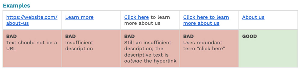
- The link’s text needs to describe its destination with no additional context needed from surrounding text. A link labeled only as “learn more” doesn’t tell the user what they’ll be learning more about.
- Don’t use redundant words like “click here”, “link to”, etc.
- In most cases, don’t use the link’s URL as its text. Most URLs are not very readable for either humans or screen readers. Use more approachable text like “about us” instead of the much less readable “https://website.com/about-us”.
- It should go without saying, but links shouldn’t be broken. Whether the link is directing to an internal page, external website, or a same-page anchor, make sure its target exists.
- Try to avoid redundant links – adjacent links leading to the same destination. These create repetitive navigation for keyboard and screen reader users.
Media
Media encompasses any images, videos, or files you upload or embed on your site. Depending on the media type, there are different rules to follow:
Image Alternative Text
Alternative text (or “alt text”) describes an image for users with visual disabilities as well as search engines, and will display in place of the image if the file fails to load.
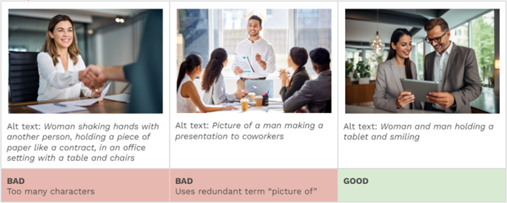
- Alt text should be succinct – less than 100 characters.
- Don’t use redundant words like “image of”, “picture of”, etc.
- All images on the same page should have unique alt text. Don’t reuse identical alt text across multiple images.
Images Of Text
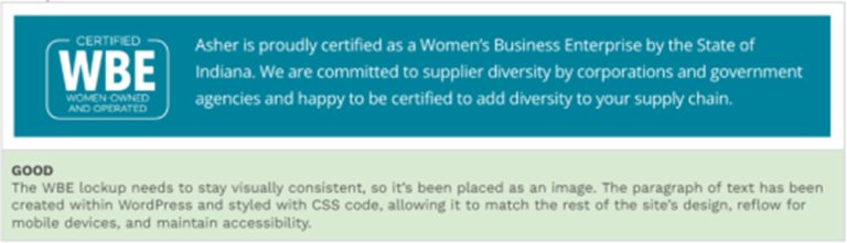
It used to be common web design practice to create type treatments in Photoshop and export as an image – web font selection and CSS styling options were limited, and an image was the best way to achieve a custom text layout. Thankfully, that’s no longer the case, so images shouldn’t contain text that is intended to be read.
- Text is best implemented using your website’s existing modules and text fields. Unlike an image of text, browser text can be resized without losing clarity, can have its colors or language adjusted by assistive devices, and is generally better for accessibility, mobile devices, and SEO.
- The exceptions to this rule would be logos, wordmarks, infographics, or other “specialty” cases where visual accuracy is imperative. In these cases, the image’s alt text needs to match the image’s text as closely as possible.
- Unlike other issues in this document, automated testing can’t currently detect images of text, so this won’t be something we report on during our monthly accessibility monitoring – making it even more essential to understand and follow this best practice.
Audio / Video
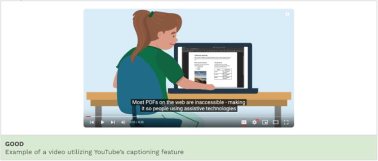
Any media with audio needs to have captions and/or a transcript to be accessible for users with auditory disabilities. This includes audio-only media (like a podcast) as well as videos that have an audio track.
Files
Accessibility standards apply not only to your website, but also any documents you have available for download on your website – PDFs, Word, Excel, PowerPoint, etc. To make your website fully accessible, these files also need to comply with accessibility standards.
In some cases (a large annual report, a complicated spreadsheet, etc) a downloadable file is truly the best way to present your content. However, wherever possible, we recommend adapting the content from these files as native site content (pages, etc):
- Files need to be run through a separate accessibility process. This includes converting all files to PDF format (the most compliant format) and adding specific code markup within the file.
- Any time a file’s content is updated, the file will need to be re-run through the accessibility process, so frequently updated files will accrue costs over time.
- Making users download a separate file takes them away from your website, which is bad UX.
- This is an especially bad experience on mobile, requiring users to pinch and zoom to view documents that were likely designed for desktop or print.
- Files are also less optimized for search engines and will probably not be crawled.
Native site content has none of these issues – it will follow existing site accessibility, have no extra cost, adapt smoothly for mobile, and be crawlable by search engines.